Code, handmade soul
and visual direction
For me, frontend development is not only about writing code. It is the place where structure, logic, design and emotion meet.
I have always been drawn to handmade creativity: textures, colors, details, composition and the feeling that something was created with intention. Web development gave me a new way to bring that instinct into a digital space.
What inspires me most is the moment when an idea becomes real: when layout, code, movement and atmosphere begin to work together on the screen.
I like building interfaces that feel clear and usable, but not empty. I care about structure, spacing, responsive behavior, visual hierarchy and the small details that make a website feel alive.
My strongest side is visual direction. I often see the mood, palette, rhythm and atmosphere of a project before I can fully build every technical detail. That is why I keep improving my JavaScript, React and frontend skills through practical projects.
I do not see learning as a separate stage before creating. I learn while building. If a task requires a new tool or a new technique, I break it down, test it, improve it and move forward.
In this portfolio, some parts were created with AI support as a creative and technical assistant. The concept, visual direction, structure, final decisions and overall identity remained mine.
I use technology as a tool, not as a replacement for taste, intention or responsibility. AI can help generate, test and speed up ideas, but it cannot decide what feels right for a brand, a user or a visual story.
That is why I pay attention to details that are not always visible at first glance: micro-interactions, soft transitions, hidden accents, light, contrast and the emotional rhythm of a page.
Every interface should have a reason behind its choices: who will use it, what they should feel, what action they should understand and why each element belongs there.
This portfolio is my personal creative world. It is intentionally more expressive, because it shows how I think, what I notice and how I build atmosphere.
Client projects are different. They are not built around my ego or my personal taste. They are built around the client’s audience, business goals, clarity, usability and comfort.
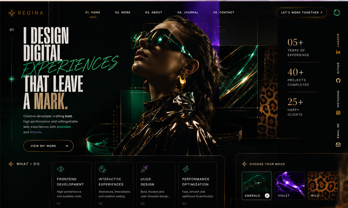
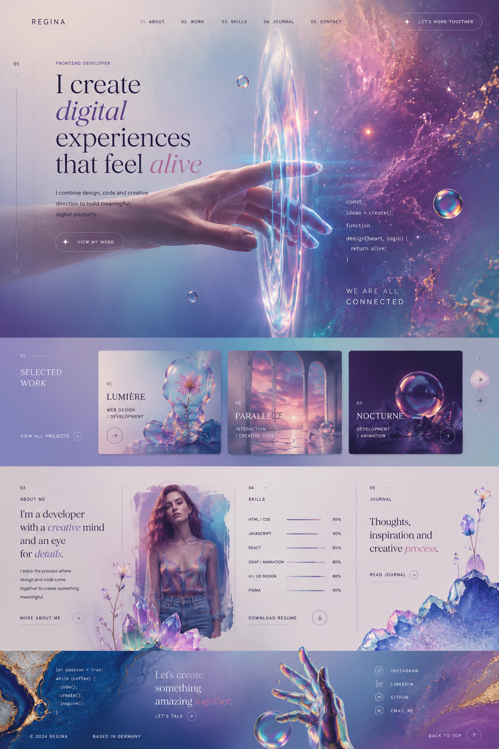
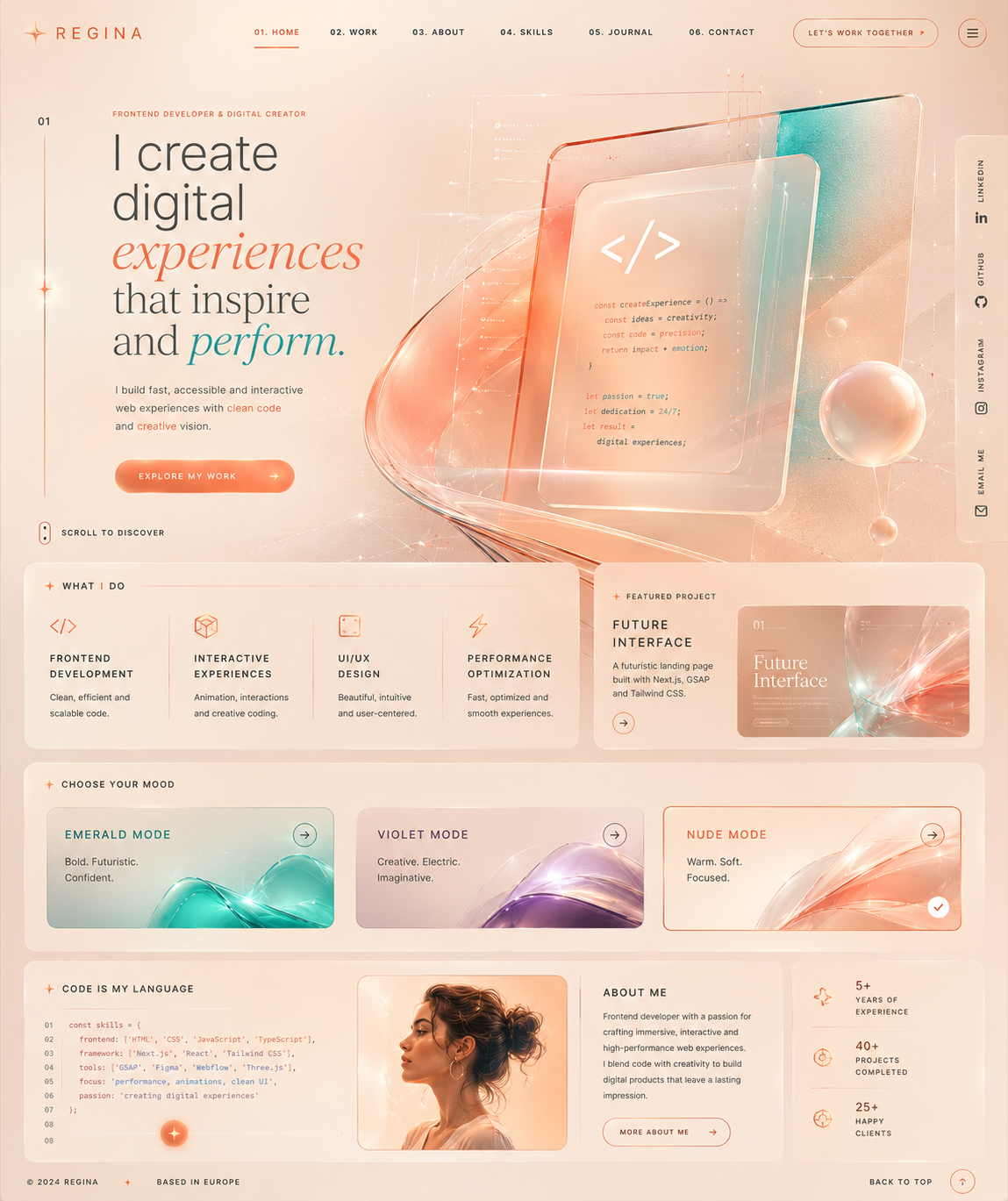
This is why I created three visual worlds instead of one simple theme. I did not want to hide different sides of my creativity. I wanted to show that one person can work with elegance, intensity and emotion — while still keeping structure and purpose.